Amherst College may be self-destructing over the novel COVID-19, but the stars move in the heavens, and so my work continues.
One last proposition:
This past week we submitted our proposals (fingers crossed) and learned how to use a program, AstroImageJ, to create light curves from our aligned images. I reduced our entire observing run, filling out my preprocessing pipeline notebook. I implemented a sigma clip stacking method into my cross-correlated median stacking function. We were provided a python script for sigma clip stacking which I used as the basis for two functions, one of which takes a list of file paths and sigma clip stacks them, the other which takes a numpy ndarray of images and sigma clip stacks them.
Sigma clipping is the process of rejecting values from the computation of a measure of central tendency (like a mean or median). Specifically, values outside of some multiple of standard deviations (commonly denoted by the letter sigma) away from the measure of central tendency are rejected, and this process can be iterated a number of times to remove outliers from some distribution. Our sigma-clip stacking function, based on the script written by M. Petersen in 2018, is included at the end of this post, far below.
After running all our data through our entire pipeline, everything worked great, and all the images came out as expected (a first)! With that milestone down, my next two tasks were 1) compare my results with my partner, Lena’s, to ensure our individual pipelines were achieving the same results (so that they can be merged later) and 2) test out AstroImageJ and construct some preliminary light curves.
“Comparison is the death of joy”
Says Mark Twain – but what does he know? Comparing Lena’s pipeline results to mine resulted in a much less dramatic conclusion; whatever Twain must have been comparing, he certainly had a harder time than I.
In order to compare the results of our separate pipelines, Lena sent me a random aligned, flat-fielded, and bias subtracted image. I found the comparable image on my thumbdrive, and I used my cross-correlation function to align our two images. If our pipelines produced the same results, these two images should have the same shifts and subtracting them (once they’ve been aligned to each other) should produce a blank image (subtracting something from itself, or something equivalent to itself, should result in nothing).
I wrote a small script that calls my cross correlation function, aligns the two images, subtracts them, and then saves the resulting image. The first result, the image shifts, were positive: shifts of 14.0500917 vs 14.0500089 and 10.126258 vs 10.126257, implying our pipelines are spatially equivalent to 6 orders of magnitude.

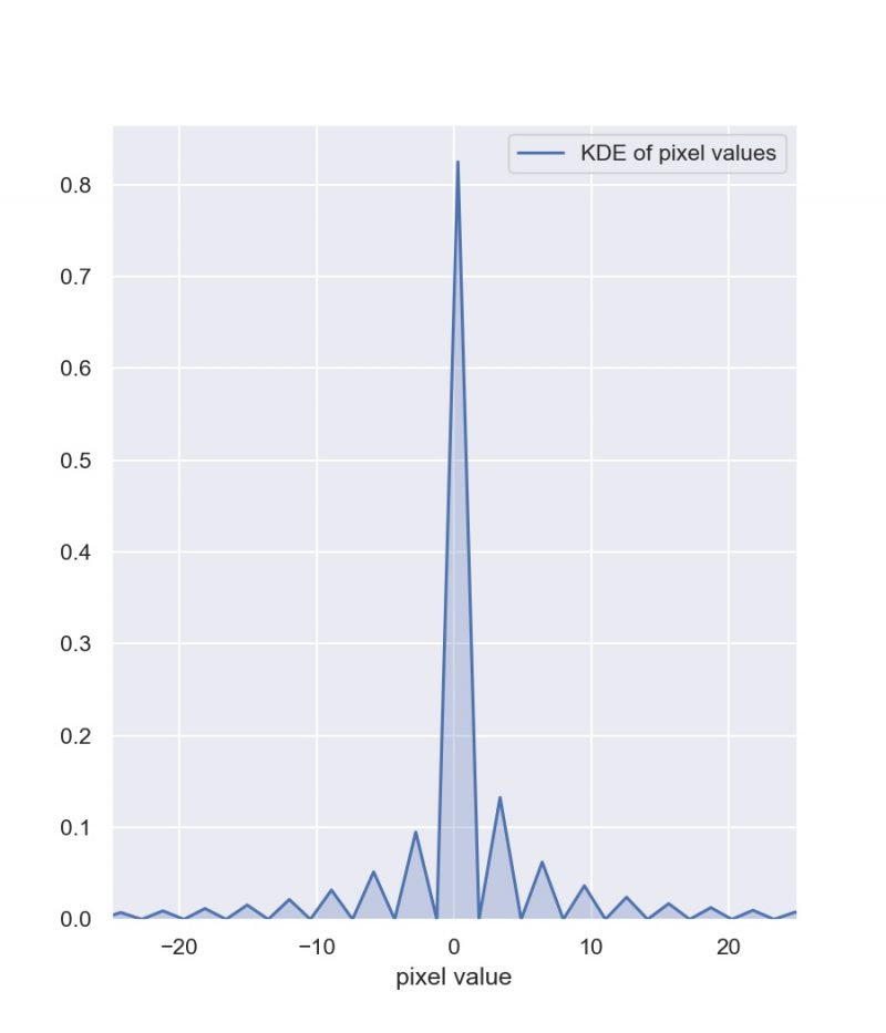
The difference images themselves were also encouraging. Their background levels appeared to be nearly zero, with slight hiccups at the locations of discontinuities (such as bad pixels) as well as some strange effects at the locations of stars in the images. I believe the strangeness near the bad pixels was due to the fact that Lena hadn’t implemented bad pixel masking by the time she sent me her random file. As for the weird lobed structure at the locations of stars, I was assuaged by the fact that the pixel values, even at the sites of those strange structures, were nearly zero and incredibly small compared to the pixel to pixel variation in our images (as demonstrated by the range in the colorbar).

As a final check, I constructed a distribution plot of the pixel values in this difference image in order to determine the pixel values are centered on zero, which they are.

With doubts about the compatibility of the group’s pipelines assuaged, we can finally start exploring our data. We want to know how the brightness of stars in our images varies in a particular color of light; variation in this color of light is thought to represent solar flaring (and other magnetospheric activity, present in all stars) as well as accretion (present in young stars). To do this, we’ll plot the brightness of the star during each cycle of observation across the length of the observing run.
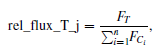
According to the abstract of Collins et al. (2017), “AstroImageJ… provides an astronomy specific image display environment and tools for astronomy specific image calibration and data reduction… [it] is streamlined for time-series differential photometry, light curve detrending and fitting, and light curve plotting” (emphasis mine). The program uses the following formula for performing multi-aperture differential photometry (which I described last week):
and automates the process of extracting aperture photometry for a sequence of aligned images. To explore using this tool I constructed light curves for three of the confirmed Taurus members in our images (HH30, MHO 4, and LkHa 358). I picked comparison stars randomly, selecting about 15-20 comparison stars that were non-Taurus members.

As you might notice, there are some large error bars on one of the data points. Looking at the logs for that night of observation, that was when Group 1’s atmosphere troubles began. It would make sense to discard that data then, seeing as the image looks as terrible as it does (there’s barely a sign of starlight). This is at least what I thought at first, but it turns out this data is still salveagable, because it was my alignment/stacking that resulted in some poor-quality data becoming absolutely unintelligible. That’s a correction for next week.

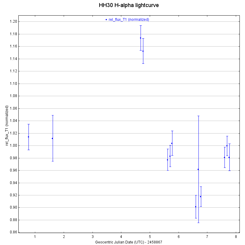
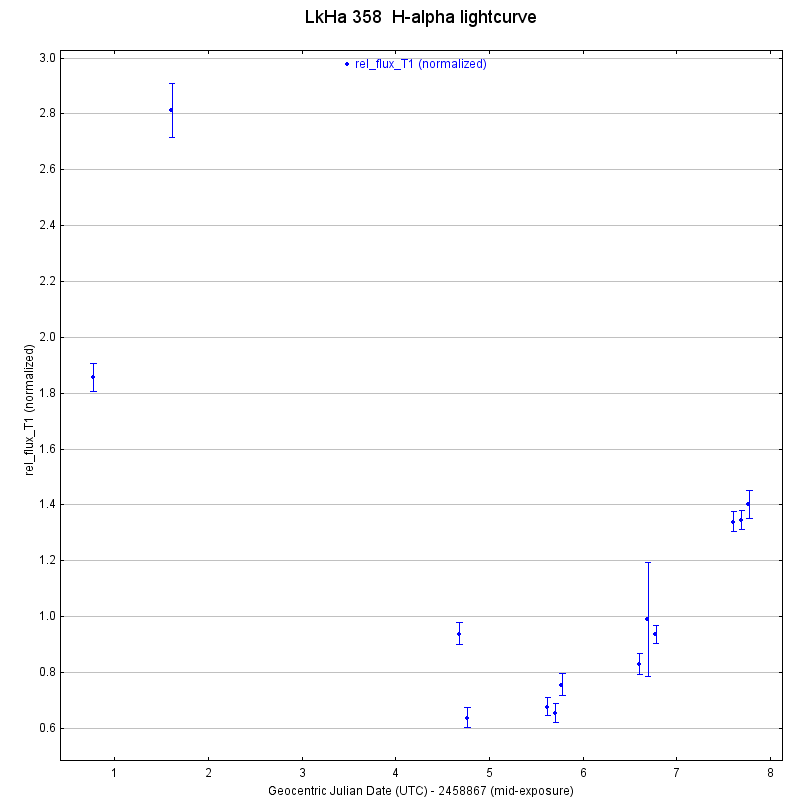
It looks like I might want to revisit the alignment on one of the images from the penultimate evening of observation as well, as it’s error bars are also much larger than the other images. I created similar light curves for MHO 4 and LkHa 358, which are also included below.

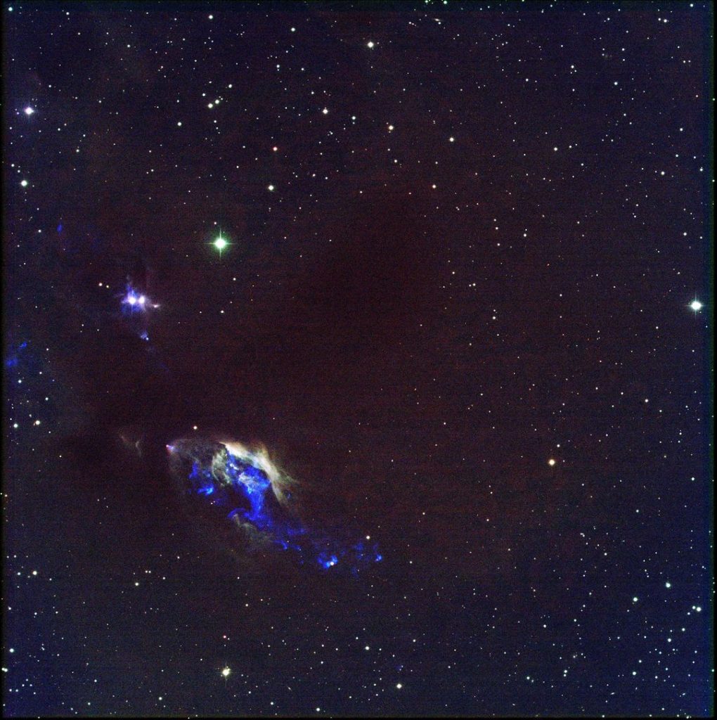
“The dwarves delved too greedily and too deep. You know what they awoke in the darkness… shadow and flame”
And what spectacular shadows and flames, Mr. Saruman! After reducing all our data, I stacked every ounce of data (well, not every, some was sigma clipped away) into two RGB images. Below is the result of a week atop Kitt Peak. Until next week, clear skies 🙂

def stack_subarray(ims, filepath, nx=4112, ny=4096, verbose=2, divisions=5):
    # reporting flags:
    #    1: timings
    #    2: array breakdowns
    verbose = 2

    # set initial timer
    t0 = time.time()

    # point at the files you wish to stack
    imglist = ims

    # set the name of the outfile
    outfile = filepath

    nimages = len(imglist)
    print('Identified {} images to be stacked.'.format(nimages))

    # these are hardcoded currently. If you cropped, will need to change
    nx = nx
    ny = ny

    data = np.zeros([nimages,nx,ny]) # >> if things get really desperate,
    you can take a small error hit and use dtype=np.float32 here
    data_out = np.zeros([nx,ny])

    #
    for n in range(0,nimages):

        image,hdr = fits.getdata(imglist[n],header=True)

        data[n] = image

    # first data checkpoint. benchmark: ~3 minutes
    if verbose > 0:
        print('{} minutes: Data read.'.format(np.round((time.time()-
        t0)/60.,1)))

    # set new timer for stacking
    t1 = time.time()


    #
    # now, the real algorithm starts.
    #
    # the goal is to break the image into tractable parts such that the draw
    # is smaller than some fraction of the memory.
    # the image will be broken up into (divisions x divisions) subarrays
    # that can be sigma clipped and medianed before being reassembled.
    #
    # you can change the number of divisions; there is likely an optimal
    # fraction of the memory to use.
    # I'm hypothesizing it is near divisions=5, but I'm not certain.
    #
    divisions = 5

    # compute the delta pixel number for division size
    da = int(np.ceil(float(nx)/divisions))
    db = int(np.ceil(float(ny)/divisions))

    # loop over both dimensions of subarrays
    for a in range(0,divisions):
        for b in range(0,divisions):

            min_a = a*da
            max_a = (a+1)*da

            min_b = b*db
            max_b = (b+1)*db

            # check that there is not array overflow. if overflowing axis,
            reshape to axis size
            if max_a >= nx: max_a = nx - 1

            if max_b >= ny: max_b = ny - 1

            if verbose > 1:
                print('A{} {}:{}, B{} {}:{}, T{}
                '.format(a,min_a,max_a,b,min_b,max_b,np.round((time.time()-
                t1)/60,1)))

            # excise the portion of the data array you want to operate on
            use_data = data[:,min_a:max_a,min_b:max_b]

            # perform the sigma clipping
            clipped_arr = sigma_clipping.sigma_clip(use_data,sigma=3,axis=0)
            median_clipped_arr = np.ma.median(clipped_arr,axis=0)
            medianed_data = median_clipped_arr.filled(0.)

            # reinstall subarray in full array
            data_out[min_a:max_a,min_b:max_b] = medianed_data


    # first data checkpoint. benchmark: ~25 minutes for 88 images
    if verbose > 0:
        print('{} minutes: Data clipped.'.format(np.round((time.time()-
        t1)/60.,1)))


    fits.writeto(outfile,data_out,hdr,overwrite=True)

    if verbose > 0:
        print('{} minutes: Fin.'.format(np.round((time.time()-t0)/60.,1)))
Leave a Reply